So I thought I'd have a go at a typographic project. I've recently been interested in the Buddhist concept of anicca, or impermanence and I thought the word would make an amazingly ironic tattoo. So I suppose this could be used as a tattoo if I had the will/balls to get one.
I started out with some initial concepts in a layout pad:
 As you can see, some of them are pretty terrible, involving skulls and bowls of fruit and incomplete dhamma wheels. But hey, we've all got to start somewhere. However out of this brainstorming came this idea:
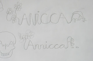 I liked the idea of life's impermanence as associated with anicca, so I thought a good way of showing this was to show a flower in the full bloom of life and then at death's door. "Not very cheery" you may well retort, but I don't think it's pessimistic, it's simply reality. That's right, my typographic projects have an existential point to make. "Not very well spelt" you may also retort and yes, you'd be right.

Getting the spelling correct again, I drew up this lettering using a grid and joined the letters together in a like cursive script.
 Then I added the flowers. I decided on lotus flowers sue to their association with Buddhism and their effectiveness in this design. There was a lot of tracing and retracing involved before I had the finished design in pen.
 This I then scanned in and traced in Illustrator. I neatened the rough bits out and although it doesn't look perfect, this adds to it I think as there's too much uniformity these days. That's my excuse and I'm sticking with it.

 Then I just added some colour. After playing about with different brushes in Photoshop, I decided that ink spots would be better, so I "borrowed" some from Google. I could have made them myself but it would just look the same as this, so I saved myself some time. SUE ME. Then just a blotting paper background et voila!
I started out with some initial concepts in a layout pad:


Getting the spelling correct again, I drew up this lettering using a grid and joined the letters together in a like cursive script.


Beautiful. Thanks
ReplyDelete