Thursday, 29 August 2013

Warsaw Oil painting

Apart from the outlines, I did this painting in one day, which may be a new record for me. I decided on a street scene in Warsaw focusing on the Palace of Culture and Science, an example of Stalinist Baroque architecture. I am fascinated with this style, an odd combination of Communist brutalism, American Skyscraper and Gothic revival. It's a huge bloated testament to Stalin's huge bloated ego and easily the most visible building in Warsaw, totally compelling in it's ugliness.  Here's where my picture started:
I then added the sky and the main part of the building using a pallette knife as usual. I wanted it to look like it was raining buckets because, well, it was.
At this point I was pretty happy with it but I had to decide if I wanted to make it look like it was really raining. Art, as is life, is all about taking risks, so I attacked my newly painted loveliness with a palette knife like it was the bathroom door in The Shining.
Raining buckets see? I wasn't that sure I'd got it right but I carried on regardless. I painted the light in the building below Stalin's tower and then added the pillars, road adjoining building and trees.
Adding a car, lampost and lights, I put my palette knife through the it all again whilst it was still wet. I think my gamble has paid off, it's a very atmospheric painting. I think it captures my visit well.


Thursday, 22 August 2013

Typography: Anicca

So I thought I'd have a go at a typographic project. I've recently been interested in the Buddhist concept of anicca, or impermanence and I thought the word would make an amazingly ironic tattoo. So I suppose this could be used as a tattoo if I had the will/balls to get one.

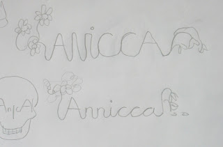
I started out with some initial concepts in a layout pad:

As you can see, some of them are pretty terrible, involving skulls and bowls of fruit and incomplete dhamma wheels. But hey, we've all got to start somewhere. However out of this brainstorming came this idea:
I liked the idea of life's impermanence as associated with anicca, so I thought a good way of showing this was to show a flower in the full bloom of life and then at death's door. "Not very cheery" you may well retort, but I don't think it's pessimistic, it's simply reality. That's right, my typographic projects have an existential point to make. "Not very well spelt" you may also retort and yes, you'd be right.


Getting the spelling correct again, I drew up this lettering using a grid and joined the letters together in a like cursive script.
Then I added the flowers. I decided on lotus flowers sue to their association with Buddhism and their effectiveness in this design. There was a lot of tracing and retracing involved before I had the finished design in pen.
This I then scanned in and traced in Illustrator. I neatened the rough bits out and although it doesn't look perfect, this adds to it I think as there's too much uniformity these days. That's my excuse and I'm sticking with it.

Then I just added some colour. After playing about with different brushes in Photoshop, I decided that ink spots would be better, so I "borrowed" some from Google. I could have made them myself but it would just look the same as this, so I saved myself some time. SUE ME. Then just a blotting paper background et voila!


Thursday, 15 August 2013

Oil painting: Day 3

I decided I didn't like the cobbles or the bricks because they were too detailed and were different in style from the rest of the painting. The cobbles weren't bright enough either, it needs to look like the sun's rays are bouncing off them. So I slopped a load of white paint over it and started again. The ground looks better now but still not perfect. I like the thickness of the paint though, it gives the painting real texture, although that's not too evident from these pics.
It was then just a case of adding some figures into it. I chose 2 Indian women but they're possibly a bit high up in the composition, leaving too much foreground. I might make the shadows of the people and building a bit longer to  break up that white space. Or maybe insert another boulder (as they were all over the shop in Jaisalmer). Or maybe re-paint the cobbles again. It's almost finished now, just a few last touches, I'd say. This is about 12-13 hours work:

Tuesday, 13 August 2013

Oil painting: Day 2

I got up early today and continued my painting. I want to capture the heat of Jaisalmer in this painting, because it's bleeding hot, lying as it does in the middle of the Thar Desert. I want to recreate the heat rising of the cobbled streets. Anyway here it is after 2 more hours:

It was at this point I realised I should have probably painted the sky first. I seem to do this every painting without learning from past. Next time! I think I like doing the fun bits first and I was listening to Sparks. They're not a sky kind of band.

So here it is at the end of the day. I'd say this is about 7 hours more work in total; getting there...


Monday, 12 August 2013

Oil painting:2 hours in

Right, I'm new to this so be nice. Even if i make some big clunking newb no-nos.

I've started a Blog to motivate me to do more art work. This may obviously backfire if everyone thinks my work's crap but them's the breaks. I am working on a painting at the moment of Jaisalmer in Western India which I visited last year. It's very early days but here it is:


This is 2 hours in, IT WILL GET BETTER. And that includes cleaning my palette which I lazily left daubed in paint last time I finished a picture. Oh it's in oils by the way and I use a palette knife. Join me tomorrow for more riveting updates, Paint-pickers!