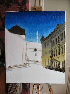
After a bit of a break doing boring stuff like paid work I started (and finished) a painting yesterday of a street in Talinn, capital of Estonia. The old town of Talinn is remarkably intact and feels like you've gone back to the 14th century. And don't they just know it with daily Medieval duels in the town hall and crossbow lessons at 10 Euros a pop. My painting ops for a more atmospheric twilight scene with the peculiarly emaciated town hall tower rising like a minaret behind a row of shops and cafes.
After drawing the vague outlines in, I started with the sky. I like painting skies and because this one was a clear night it was pretty simple.
After doing some of the rooftops, I then filled in the building to the right. I didn't see it at the time but it was too lemony.
It's a shame I didn't notice as I filled in the details making it much harder to change the shade of the building later. I added the tables and parasol too.
Then came the fun bit, the building in the background and the big sea of brown cobbles in the foreground. The background building is closer to the shade I want and contrasts with the cold palette of the building on the right. It would never do.
I then did the building on the left which proved to be simpler than the one on the right, although it has a more varied palette. Sometimes it's just how it goes. The light shining on the cobbles were vital in breaking up the brown so I had to get it right. Which I nearly did.
With a lot more detail on the windows and a figure walking on the cobbles, I could have called it a day. But I was still annoyed by the coldness of the building on the right. I could really only correct it while the paint was still wet so I stayed up last night carefully making it more orangey. I think the result is much more satisfactory. All in all not a bad composition, but I think I could have done a better job.


No comments:
Post a Comment